16 Jun 2014
by agnishaghosh
in Quilling
Tags: card, dad, father's day, gift, handmade, love, quilling, quillography, typography
It was Father’s day yesterday and I wanted to make something special for my dad. He is the best father in the world. Given me things even before I have asked for, stood by me always, made me understand my mistakes patiently and most importantly made me the person that I’m today.
I decided to make a card with the word ‘Dad’ for him. I used a patterned paper for the background and then sketched the alphabets on it. Selecting colors for the card was a challenge though. I decided to go ahead with shades of blue, green and yellow to make the card look nice and fresh. 🙂 I just had a day to finish the card and hence I decided to use tight coils and quillography to make a quick but good looking card. So here are some pics of the design and the card. Dad loved the card and has already displayed it in his showcase. Btw, this is also my entry for the Indian Quilling Guild Challenge # 1 🙂 What do you think? Did you like the design? Do share your feedback 🙂 


31 May 2014
by agnishaghosh
in Quilling
Tags: book cover, design, paper, purple, quilled, quilling, sketch, typography
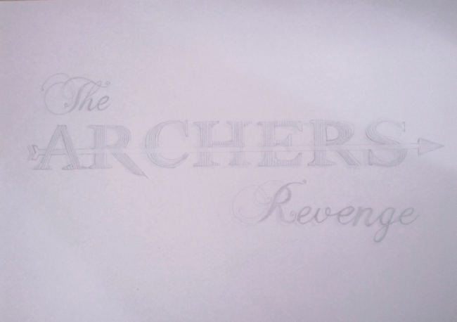
I got the opportunity to work on a book cover after the author Destination Infinity saw my work on this blog. I have only seen book covers designed by Yulia.
I was super excited to work on it. How many times do you get the opportunity to work on a book cover and that too a quilled one. This was the first time I was designing for a book cover. I had to start from scratch. From coming up with a concept basis the story, to adhering to client requirements. It was super exciting! My entire dialogue with the author was on email, the briefing, the 1st design, the final design images…everything. And might I say, it went on very smoothly. This is an A3 sized design and took me around 30 hours to complete. Getting the shading right was extremely challenging…completely drained me out! But the final outcome was worth the effort.
So this is the final sketch of the title which was approved.
The color scheme which we opted for this design was shades of purple.I wanted to give this a complete gradient feel which I guess I was successful with. So here are the pictures of the design. The design is still being made, but my quilling is done 🙂 It was an exciting project for me. Did you like it? Will share the final design once it is ready. This is my 3rd entry for Pratvam Progs contest as well.
This is how the final cover looks like and you could buy the book from Amazon.in using this link.


28 May 2014
by agnishaghosh
in Quilling
Tags: colored kundans, craft, customized, earrings, handmade, paper, paper jewelry, pearls, quilling
I love making paper jewelry, but haven’t made anything for months now. A couple of friends checked my FB page and loved the earlier earring designs. However, one of them wanted me to make something different, something which was only for her. So I sketched a couple of designs and converted them into paper jewelry using quilling.
So these are the initial sketch designs:

Sorry for the bad quality pictures. My phone camera just messed these up completely 😦 The final product are wee bit different from the final design, but that’s the process of creation.
For the final pictures I borrowed my friend Unmesh’s phone and they turned out very well. Have a look:

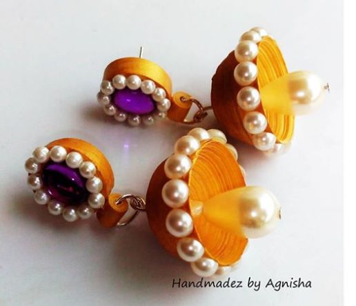
Paper jewelry making is a lot of fun. None of the people who saw these designs could believe they were made of paper 🙂 My friend loved both the design and asked me to make them in different colors for her as well. Have five more requests of similar designs to be finished this weekend and am super excited about that.
Btw, I’m entering it for the Pratvam progs 1000 likes contest as well. Hope to win! 🙂
Happy Quilling!
12 May 2014
by agnishaghosh
in Quilling
Tags: butterfly, card, colors, contest, floral, mom, mother's day, quilled, quilling, typography
Yesterday was Mother’s day and I had to do something special for my mom. I can’t describe in words what she means to me or what she has done for me. I guess this applies to all of us, no?
So this is what I made for her, a card with the word ‘Mom’ quilled. The card took me around 6 hours to complete. I used my mom’s favorite colors in the design just to make it more personal 🙂
So here is the sketch as well and the final design. Let me know what you think!
The sketch:
The design:
Also, Happy Mother’s day to all the mommies reading my blog.
08 May 2014
by agnishaghosh
in Quilling
Tags: adidas, buuterfly, contest, green, quilled, quilling, white
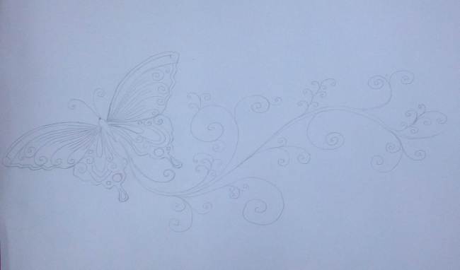
So, Adidas presented a challenge recently via its poster contest ‘Think White’ for their uber elegant Stan Smith shoes endorsed by the legendary tennis champ Stan Smith.
When I saw the ad for this contest, I knew I had to participate. However, the thought gave me jitters as I knew that my work will be competing with the best minds in the creative field. Just to give you a background, although I’m creatively inclined, I work as a Client servicing manager and am still learning the basics of AI and Photoshop hence I asked my friend cum colleague Unmesh to help me with the layout.
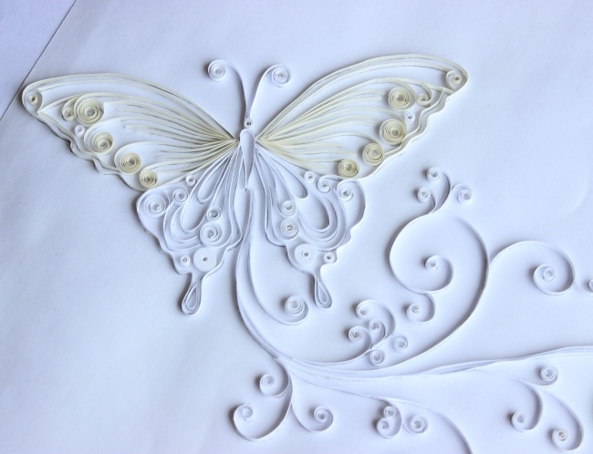
So this is my entry: Every sports shoe brand focuses on the strength and performance of the shoes and very less importance is given to its beauty in any communication. So when I came across the shoes, the only thought that came to my mind was, ‘Wow, this is so beautiful, so elegant’. And hence I decided to focus on the beauty aspect of the shoes. As the brief was ‘Think white’, I decided to have a unique take on it. I personified the shoes so as to say that, ‘shoes so beautiful that it inspires nature’. Since the shoes were launched in 1973, I added that bit to the communication as well. I showed a beautiful white quilled butterfly emerging from the shoes. This butterfly took me around 5-6 hours and was completed over-night. I added green tinge to it to show that it is inspired by the shoes.
The final poster:

The sketch:
The final design:

Close up of the work:


I’m not sure whether I would win, but I was more than happy about participating in this challenge. I’m also putting this as my entry for the Pratvam Progs contest. Hope I win at least one 😉
Would be very happy to hear from you about my work. Do share your feedback 🙂
24 Mar 2014
by agnishaghosh
in Quilling
Tags: butterflies, flowers, gift, name, name board, pink, purple, quilling, quillography, shades, typography
A special project for a special friend. This is quilled name board for a friend’s niece. He gave me the color scheme (purple and pink), the theme (floral) and the fonts and asked me to play around it. I made multiple sketches before freezing on this design. The final outcome was bright, clean and colorful. The frame was shipped to the US and currently rests in Zara’s room.
Was a fun project for me and a thoughtful gift from an uncle to his niece.
This is the final project:
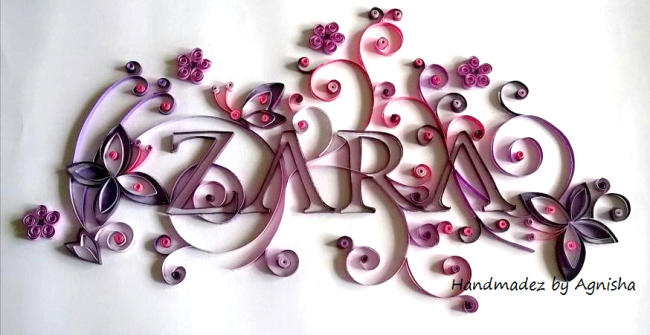
The close up view:


Let me know if you liked it 🙂
06 Mar 2014

A special engagement gift for a couple with their initials.
The initials and the design was created by a friend. I took a print out of the design on white card stock and started quilling on it. I have used reverse colors on the alphabets to signify love and how important it is to compliment each other in a relationship. I wanted to keep the design simple and minimalistic and I think it looks just that way. What do you think?
I framed it in a shadow box but forgot to click a picture of that 😦
However, the couple loved the personalized gift.
Do leave your feedback. Helps me work better 🙂
Image
by agnishaghosh
03 Mar 2014

My latest creation, a quilled carnival mask 🙂 This is my entry for the Handmade n Beyond Carnival contest.
Here I have tried my hand in paper cutting along with stone setting and of course quilling. I wanted the mask to look glamorous and thus crystals did the trick for me. I have also used feathers for embellishment.
So what do you think? It does justice to the theme?
Awaiting your comments 🙂
Image
by agnishaghosh
25 Feb 2014
by agnishaghosh
in Quilling
Tags: blue, Cactus, green, paper, pink, quilling, red, typo, typography, violet, yellow
This post has been long over due as I was waiting for my friend to send over the pictures to me.
So this was a gift for Cactus, a company which is very close to my heart because I started my career there and also because I met my husband there 🙂
So this is a quilled typography of the brand logo which I decided to gift them at their annual party. Here I have used the company logo and used the colors of the 6 values (integrity, excellence, trust, fun, communication and innovation) to create the design. The idea was to show how the six values are an integral part of Cactus culture.

The 1st Draft – Typo of the company logo
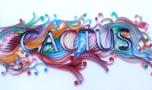
Completed Typo
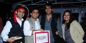
Presenting the quilled frame at the party
Presenting the frame to the owners of the company Mr. Anurag Goel and Mr. Abhishek Goel at the party. (That’s my husband and me on the right hand side)
@ Cactus Office, Mumbai
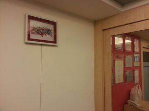
The frame now resides in the Cactus Mumbai office 😀
Thank you so much for appreciating our gift and displaying it in your office, Cactus!
They loved the frame, what about you? Let me know 🙂
17 Feb 2014
by agnishaghosh
in Quilling
Tags: bloom, contest, flowers, green, quill, quilling, red, spray painting, spring, tulips
My entry for the Welcome Spring – Handmade Floral Creations Contest by Creative Box.
I looked at this opportunity to quill some more 😉 I can never ever get tired of quilling 🙂
So this is what I did. I hand drew the tulips and then, painted them. (This is the 1st time I have painted my sketch before quilling) and I’m happy with the result. Post that I started using strips of paper to give the entire bloom a shading effect.
This is how it looked after the first flower was completed.

After finishing the flowers, leaves and stems, I thought of adding another twist to the creation. I spray painted the entire creation in hues of red, pink and green to give it a colorful effect.
This is how the piece looked before spray painting:

This is how the final piece looked after spray painting.

This is now on its way to get framed. What do you think about this creation?
Let me know 🙂
Thanks for dropping by my blog.
Previous Older Entries


Recent Comments